The Percolate Menu App allows customers to browse through menu items with pictures, offer an easier way to place orders and make payments.
Percolate is a cafe in Bedok. Currently, Percolate only has a physical menu with no pictures and short description of each menu item. As such, customers have to do their own research before placing an order.
The goal of the Percolate Menu App is to make it an all-in-one app that allows customers to browse, make decisions, place orders and make payments easily at the cafe.
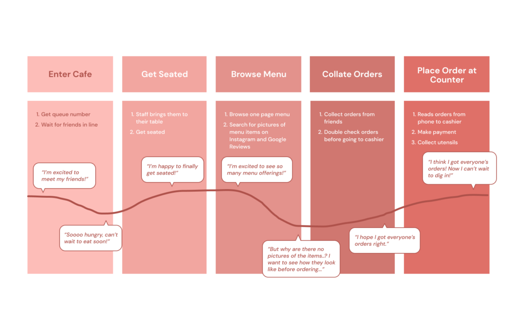
Interviews were conducted with 5 participants aged 20-30 years old, who frequent Percolate.
Prior to the interviews, I assumed that all customers prefer using a menu app to ordering at the counter/via service staff. However, it took me by surprise that 2 out 5 participants prefer the latter.
With the insights gathered from the interviews, I created a persona to represent the users.
Problem Statement: Rebecca is a full-time student who needs a quicker and easier way to view pictures of menu offerings because she wants to know how they look like before placing her orders.
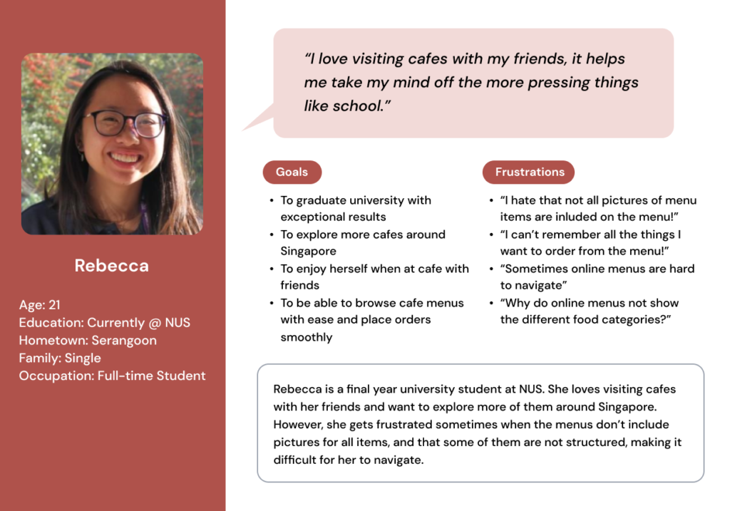
Rebecca is frustrated because there are no pictures of the menu items, and she wants to be able to see the pictures before deciding on what to order.
Paper wireframes are great for quick iterations and exploration of different design ideas.
With the users’ pain points in mind, I came up with 5 different designs for the app’s home page, and picked out the best sections from each to create a new refined version.
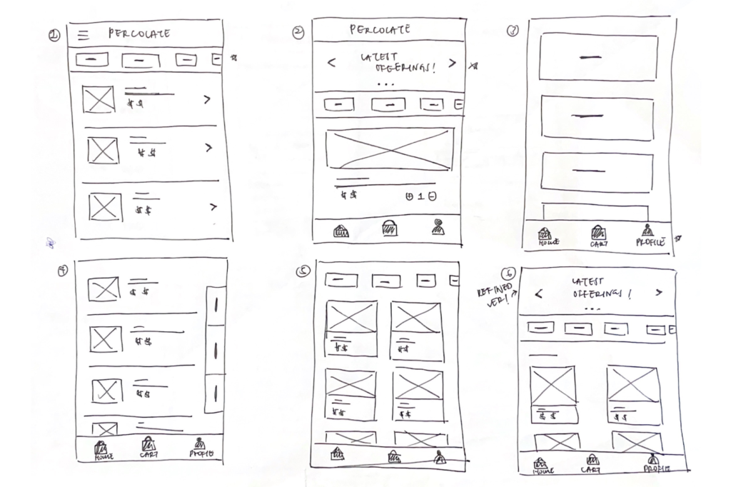
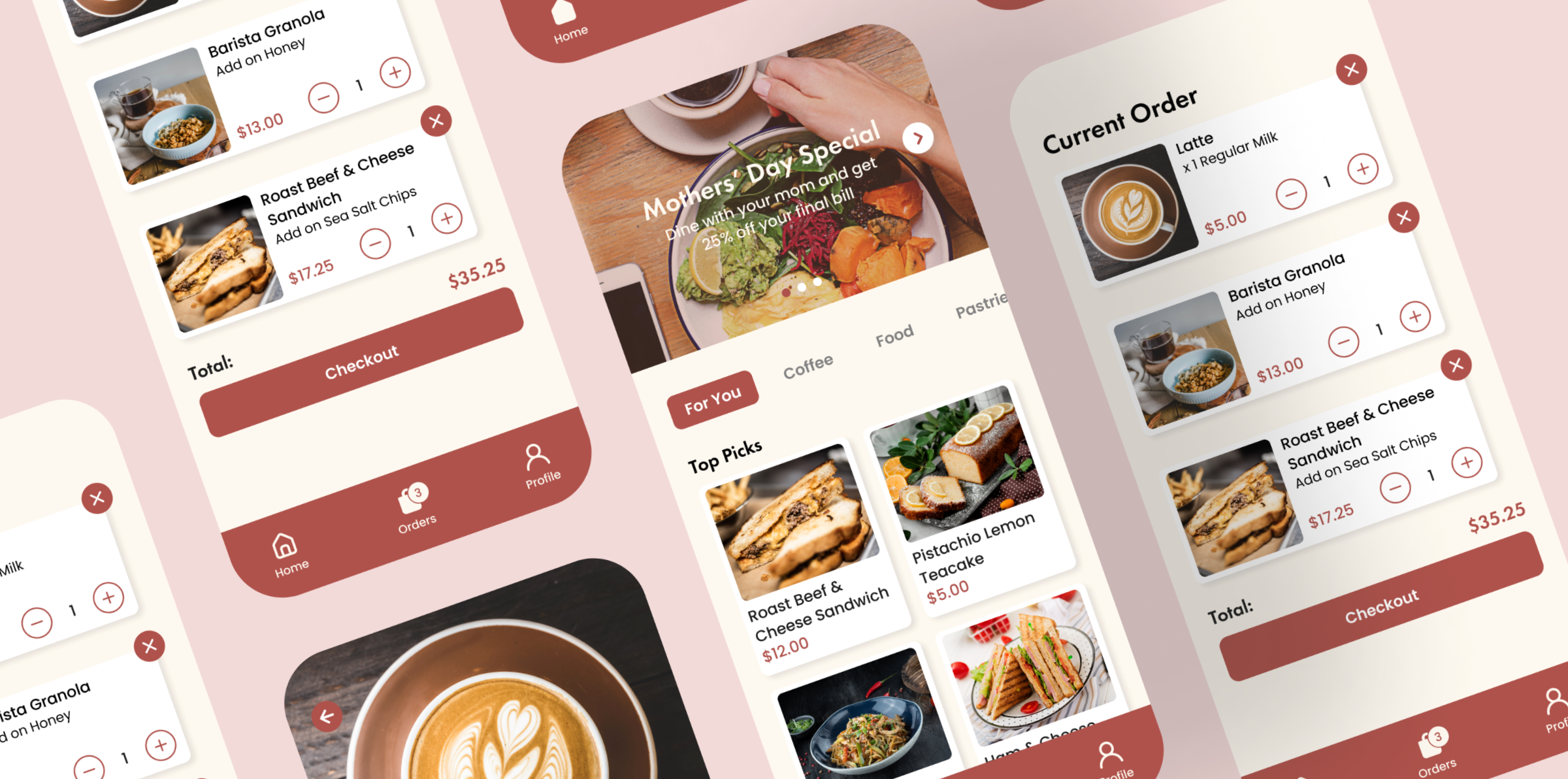
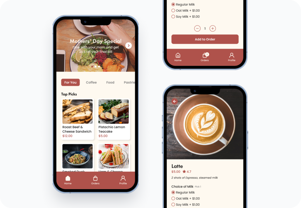
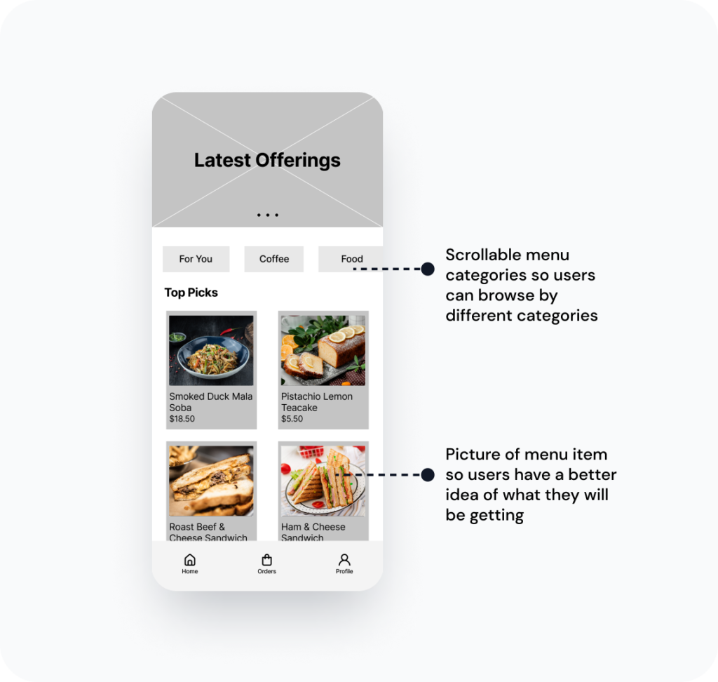
It was important that the menu app resembled a physical menu therefore I included different menu category buttons that users can click into to view menu items in each category.
I also made sure to include image placeholders for each menu item since it was one of the greatest pain points of users.
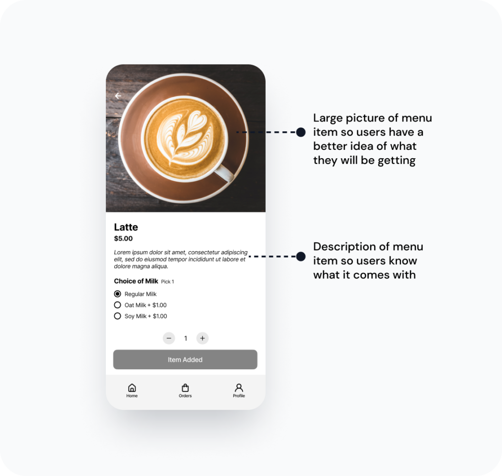
When users click into individual menu items, they get a larger version of the picture of the menu item as well as a description of what it comes with. This allows them to have a better idea of what they will be getting.
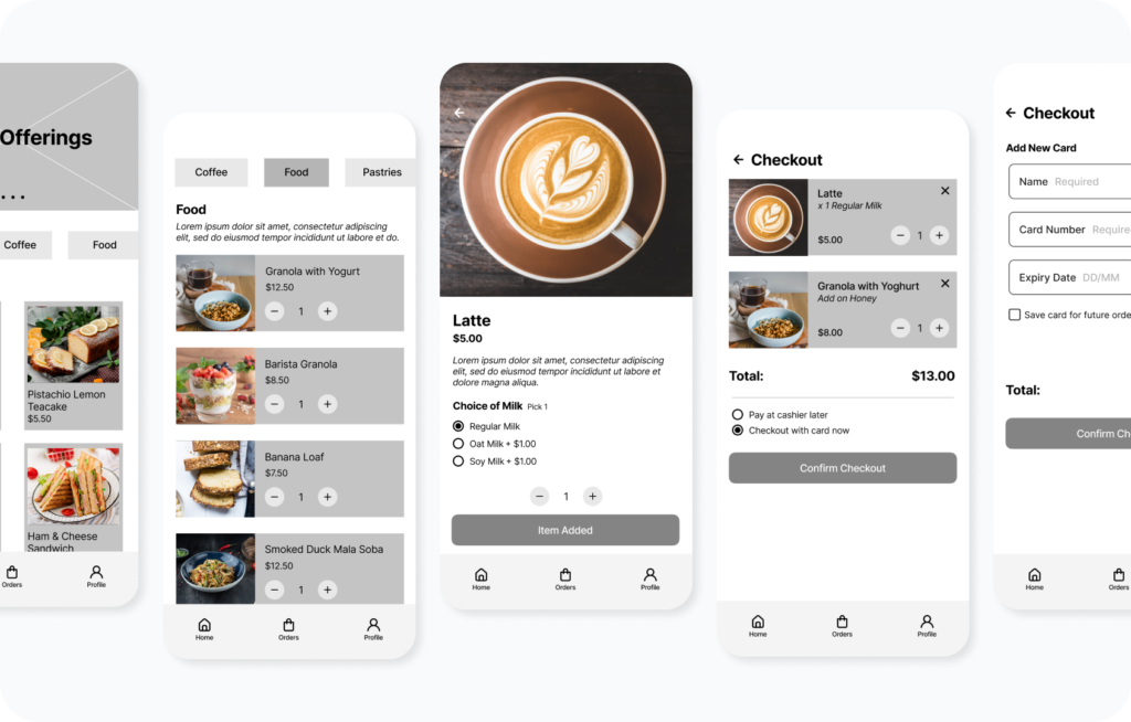
After creating all necessary screens, I turned digital wireframes into a lo-fi prototype to get feedback from users on the current user flow.
These were the main findings that the usability study revealed:
Based on the feedback from the usability study, I made changes to the prototype.
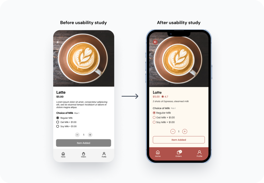
Users needed to know that their item has been added to cart. Therefore, the original “Item Added” button is now outlined to create contrast. Additionally, the cart icon also has a number on the top right hand corner to indicate the number of items in the cart.
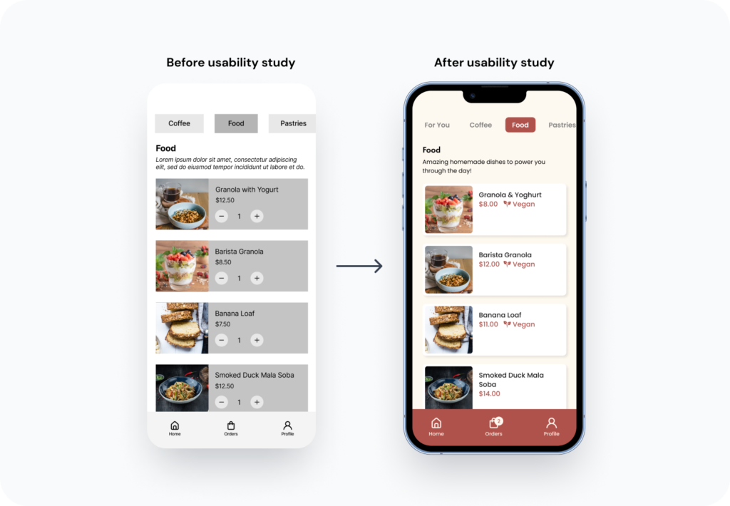
Users needed to know that if a menu item is vegan. They find it a hassle to ask the service staff about it. A leaf icon and an accompanying term is added to menu items that are vegan friendly.
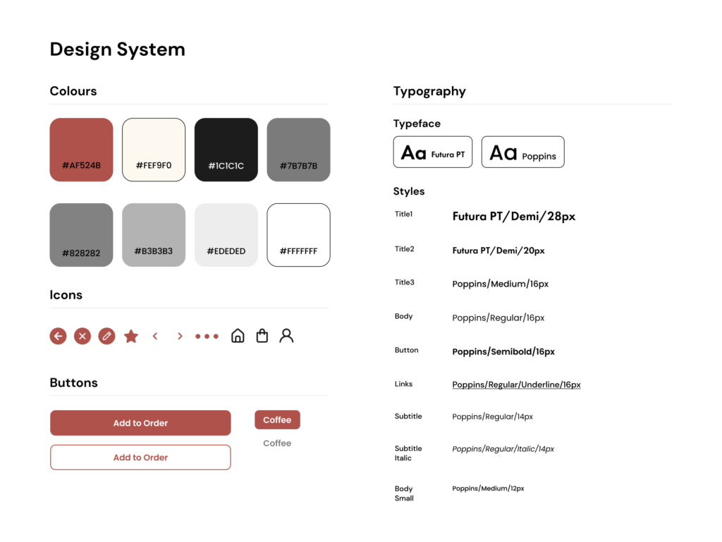
Since Percolate already has its brand colours and fonts, I did not come up with a new branding. This is so that the menu app is consistent with its existing branding, and customers can easily recognise the brand. I extracted these from their website and incorporated them into a design system in Figma.
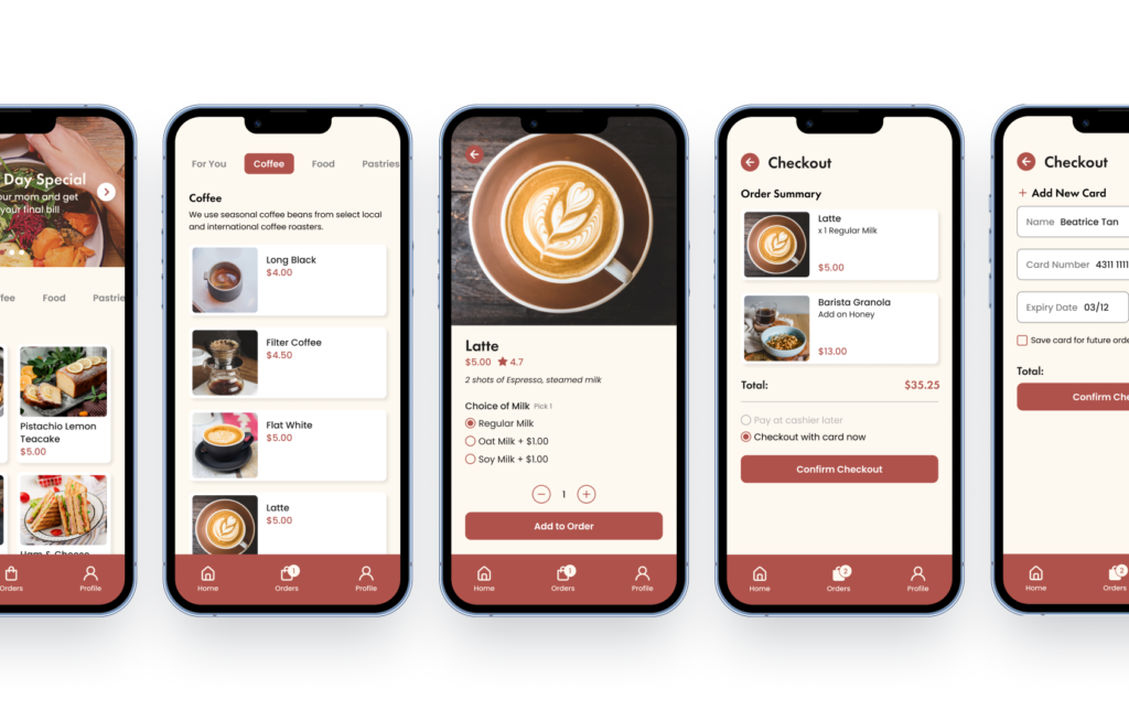
With the feedback from the usability study, I refined the designs and turned it into a hi-fi prototype.
I showed the hi-fi prototype to the participants once again and received positive feedback on it. They can foresee themselves using this mobile app when dining at Percolate.
While designing a menu app for Percolate, I learnt that my ideas do not reflect what each individual thinks. Usability studies are important to gather feedback from actual users to create an app that truly solves a problem.
As this project was done using Figma, I was able to create more advanced components and brush up on my knowledge and skills with the design tool.
The next thing I would like to do is incorporate a loyalty program system and a review section to the user flow and design. These were some points mentioned during usability testing, however were not a priority at that point of time.
Ruo Shan is a UI/UX Designer based in sunny Singapore. With over 2 years of freelancing experience, she is always ready to tackle new challenges!
© 2022 Lee Ruo Shan. Singapore – All Rights Reserved.