
Have you come across websites that look perfectly fine on laptop screens but extremely messy and out of place on mobile? I’ve met my fair share of such websites and I can’t help but wonder how many potential customers they have lost.
With increasing mobile usage these days, it is important for businesses to ensure their websites can be viewed perfectly on mobile devices. This is where responsive web design comes into play.
What Exactly is a Responsive Web Design?
To put it simply, responsive web design means your website fits nicely, and can be viewed perfectly on any mobile device. It is a design approach that adjusts the content on your website accordingly when viewed on different devices e.g. laptops, tablets and mobile phones. This allows your content to be displayed in a way that makes people feel comfortable.
To help you understand responsive web design better, let me give you an example.
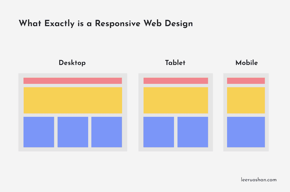
The image above shows you the layout of a website across 3 different devices – desktop, tablet and mobile. Notice any difference in their layouts?
A website may present their content in 3 columns on a desktop but when viewing on a tablet or mobile device, the content is presented in 2 and 1 column respectively. This is because there are lesser screen space on tablets and mobile devices. If we were to present a website in 3 columns on mobile, then we will need to squeeze all of its content just to fit into the space.
The result?
A screen filled with extremely small words that probably look like ants.
Therefore, responsive web design is important to make sure people viewing a website on any device can do so comfortably without having to zoom in/out.
How Can I Create a Responsive Web Design?

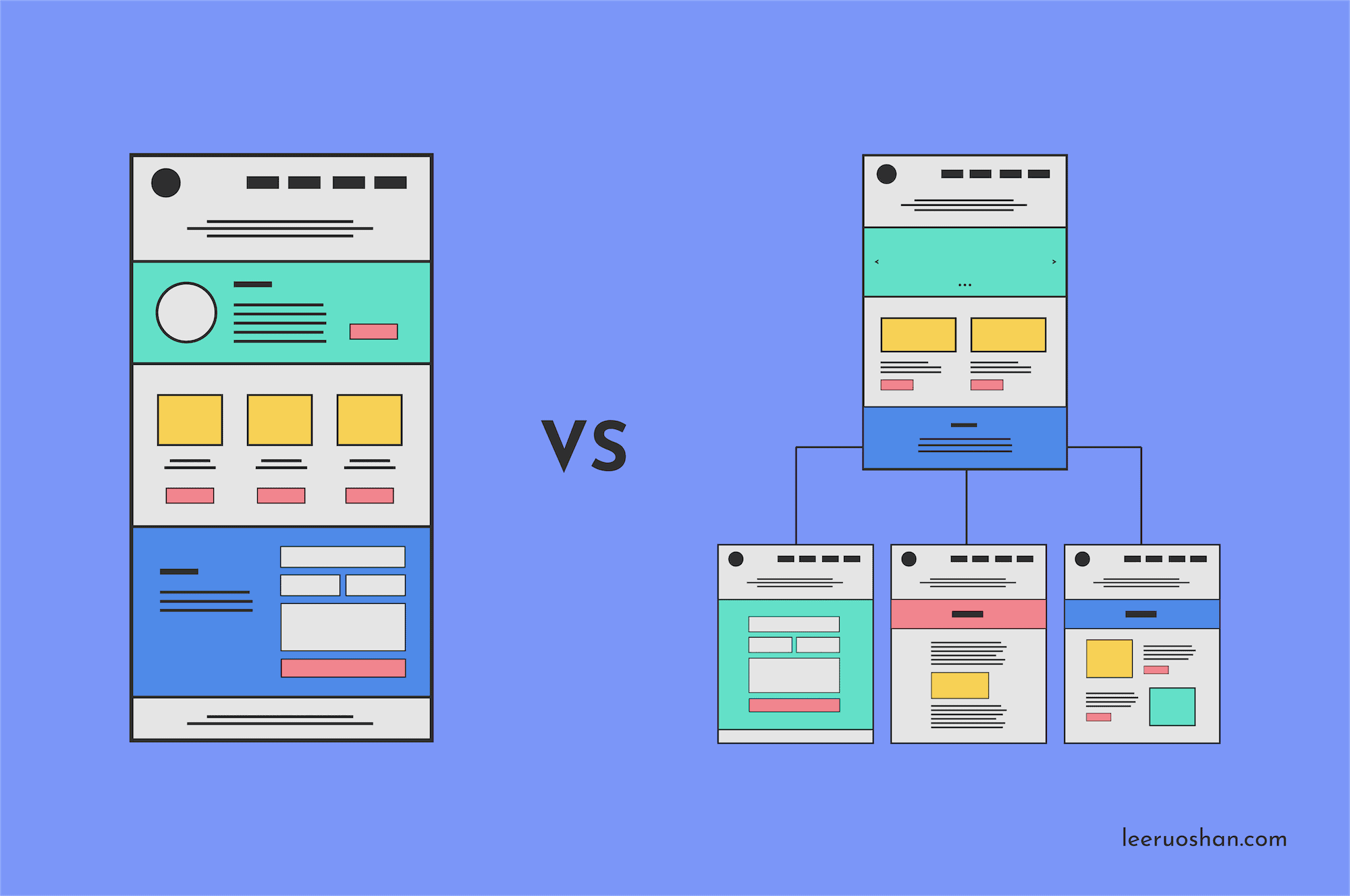
There are 2 ways you can go about making a responsive web design. The first way is to use CSS & HTML, which is pretty complicated especially if you have no knowledge in coding. The second, and also the easier way out, is to use a content management system (CMS).
A content management system is far simpler than CSS & HTML. Some of the more common content management systems are WordPress.org, Squarespace, Wix and Magneto. In fact, they are increasingly popular amongst small businesses who want to build a simple website on their own.
How Do I Know if A Website is Responsive?
Mobile-Friendly Test
Google’s Mobile-Friendly Test is one simple and great tool if you want to find out if a website is responsive. All you have to do is enter the url of the website you wish to check, and it’ll tell you whether its mobile-friendly.
PageSpeed Insights
Another great tool is PageSpeed Insights by Google. It analyses the content of a website and generates a performance score based on how mobile-friendly you website is. It also provides you with suggestions to make that particular page load faster. Just key in the url of any website you’ll like to check and it’ll do its thing.
Google Search Console
However, if you are checking the responsiveness of your own website, I highly recommend to use Google Search Console. It works like PageSpeed Insights but also alerts you of any issues found on your site so you can fix them.
The Importance of a Responsive Web Design
Now, why is responsive web design so important in this digital age? Let me share with you the 3 major reasons:
#1: A Shift to Increased Mobile Usage

As mentioned earlier, one of the reasons why responsive web design is SO important is because people are changing their behaviour. Almost 7 out of 7.7 billion people all over the world are mobile users. To add on,
40% of consumers use their mobile device to conduct research prior to making an in-person purchase. More than half routinely make purchases using their smartphones, and 55% of shoppers make mobile purchases after finding products on social media. – HubSpot
Is that not a good enough reason for you to invest in responsive web design?
#2: A Responsive Website Helps Customers Find You Easily on Search Engines

Did you know that Google’s search engine has switched to favour mobile-friendly websites?
“What does this mean and how will it impact me?”
This means that instead of crawling the desktop version of your website (what Google has been doing previously), Google now crawls the mobile version for indexing and ranking.
Why is this so?
This is because majority of the people are using their smartphones to communicate, search for information, and do their shopping online. I guess you can say desktops are becoming… out of date? (I’m kidding)
So, if your website is not mobile-friendly, you might lose out to other websites on Google’s search engine result pages, and customers will not be able to find you.
#3: A Responsive Web Design Ensures a Seamless and Consistent User Experience

Imagine a potential customer who happened to see your product on her desktop but had to rush off to run errands. On the way home, she decided to check out product again on her phone. However, unlike the excellent experience she had while using viewing on desktop, she had a hard time navigating the site on her mobile. Some of the contents were overlapping one another. She eventually gave up and left the site.
Aaaaand that is how you lose a customer because your website is not mobile responsive. In fact, 61% of users stated that they are unlikely to return to a website if they can’t find what they are looking for or if the website is not loading its content.
If your website is not responsive, you are losing out because responsive web design is here to stay! You’ll never know what device your next potential customer will be using to visit your website. To ensure the next user that returns to your website from a different device can easily access all information they were interested in, make sure your site is responsive!
It is an extremely crucial aspect to businesses as it creates good user experience. In case you’re wondering what user experience is all about, head over to my previous post on the fundamentals of user experience design to find out more!
The Bottom Line

Responsive web design is no longer a choice, its a MUST. If your website is not mobile-friendly yet, you should definitely do something about it. You wouldn’t want your website to get bumped down by Google. You definitely wouldn’t want potential customers to leave your site because they can’t find the information they want.
If you’re a small business just starting out and need help with a responsive web design, feel free to drop me an email! I have experience in creating responsive web designs that look good and actually work.